A brand is known more by its logo than by its advertisements and publicity. Almost all the leading iconic brands have logos which are recognized worldwide. An impressive logo is the one to which people can relate themselves to. The amount of hard work that goes into maintaining a brand’s identity through its logo is tremendous. Below we are listing some of the world famous company logos:
1. The Adidas Logo
Founded by Adolf (Adi) Dassler, Adidas is the world’s leading sports equipment and accessories brand. Adi’s aim was to provide all the athletes with the best and the most comfortable equipments. He followed three guiding principles: design the best for specific requirements, protection from injury and durability. The clothing and shoe logo designs of the company exhibit three parallel stripes. This is the current official logo of Adidas. This logo replaced the initial trefoil logo design which symbolized the spirit of the Olympic Games as well as the history, legacy and heritage of the brand. In January 1996, the three stripes became the brand marks for Adidas worldwide. The logo symbolizes the excellent performance and future of the brand. Over time, it has become synonymous with Adidas and its will to manufacture high quality products for athletes worldwide.
2. The Apple Logo
The owners of Apple Inc. selected an apple as their main form of branding. The initial logo depicted a small apple silhouette sitting under a tree with a computer from the company. It is this apple which has been used continually. The first logo was perceived as complex and typical to view. The bite mark was introduced by Regis McKenna for symbolizing the seduction of customers as well as the marketplace. This monochrome version was later replaced with a rainbow colored symbol. This depicted the apple tree in the story of Adam and Eve which symbolizes the Tree of Knowledge. It inspires people to pursue their wishes. Not a deliberate goal in the beginning, but it boosted the business and made the consumers consider Apple Inc.
3. The Audi Logo
The usage of the four rings as the logo generates back to Claus Detlof from Oertzen. He described the concept as coming together of groups and related to Olympiad and the Olympia. It is in sync with the fusion of the four Audi companies- Audi, Horch, DKW and the Wanderer.
4. The Bacardi Logo
This famous brand was started in 1862 by the Cuban wine merchant Facundo Bacardi. Having origins in Spain, he acquired a distillery in Santiago de Cuba. He refined sugar and liquor to white, mild rum. The logo was inspired by the large colony of bats residing under the distillery roof. Ironically, the fruit bats are considered auspicious and good luck harbours in Cuba.
5. The BMW Logo
The BMW company logo represents as well as is derived from the Bavarian components for engines which first constituted the company strata in 1917. This is also evident in the Bavarian national colours of while, blue and black. The internal and external enclosed rings and the adjoining black ring represent the previous enterprise “bayerische flugzeug-werke (BFW)”. It later formed the BMW company. The shining disks, the engine shades, the bright blue gleams and the two silver divides represent the sky in the logo.
6. The Burger King Logo
Established by David Edgerton and James McLamore in 1954, the Burger King was christened Insta Burger King. It was rebranded as the Burger King in the 1980s. Gaining reputation internationally very fast, the company’s logo was first modernized in 1994. It constituted smoother fonts with round edges. In 1999, the logo was again updated which was the stylized version of “bun-halves” logo. This new look had a blue coloured swirl which made the logo look more contemporary.
7. The Intel Centrino Logo
The logo used by the Intel Corporation is the split design. It shows the convergence between technology and information. The two wings used by the designer suggest a bridge between the advancing technology and the lifestyle and progression towards a smarter future. The use of the magenta colour for the lower wing balanced the contrasting vibrant blue and offers high energy visual stimulus to the viewer. The Intel’s famous “hanging E” is also visible in the logo. This was in initially used in the original iteration and is today carried over as an embodiment for the commitment to founding corporate philosophies.
8. The Chanel Logo

The house of Chanel was established in 1910 by Gabrielle Bonheur “coco” Chanel; one of the prominent fashion designers of the time. She revolutionized women’s wear and set forth new standards for the contemporary style. With time, Chanel as the corporate name became the symbol of elegance and synonymous with wealth and elitism. It set the standards for international fashion industry. The log was designed by Coco herself in 1925 and has remained unchanged ever since. It is one of the most recognised symbols in the fashion industry and is frequently visible on purses, shoes, accessories and perfumes.
9. The Nike Logo
Founded in the 60s by Phil Knight, Nike was called The Blue Ribbon Sports at that time. The trademark Swoosh sign and the name Nike were brought around later. The name Nike is derived from the Greek mythology after the goddess of victory. The name suggested the company a strong association and brand image which was appropriate for a sports company. The swoosh sigh along with its just do it tag, presents the essence of the brand and its philosophies. The swoosh logo has become synonymous with the company name and the brand. It inspires the consumers to be determined and ambition for desired goals in their athletic activities. It not only expressed the high ambition and will for triumph but also made the company a part of its brand and corporate culture.
10. The Ciba Specialty Chemicals Logo
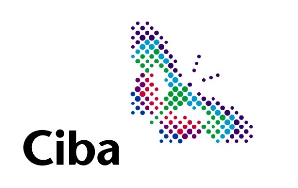
The logo of specialized chemistry section of Ciba Company exhibits the pixilated multicolored butterfly. This symbol depicts Ciba’s transformation into the future growth and expansion. The bright, multiple colours of the butterfly represent the large number of divisions which make up the enterprise.
11. The Cisco Logo
The Cisco Corporation was founded in 1984 by Len Bosack and Sandy Lerner, two computer science professionals. Ranked today amongst the top few specialist companies in routing and switching, the Cisco Corporation has permeated technology sales around the globe. The logo of Cisco is synonymous with the company’s original formation place, San Francisco and the Golden Gate Bridge which is also referred to as the gateway to the pacific. This logo hopes for eternal success.
12. The Coca Cola Logo
This international soft drink brand defies those who say one needs a dash of romance to achieve success. Ironically, coca cola was invented as a patent medicine by John Pemberton, a pharmacist. The logo is accounted to have been created by John’s bookkeeper Frank Mason Robinson in 1885. The script is believed to be cursive but is actually Spencerian typeface, a predominant writing form adopted by the era’s bookkeepers. The icon carries legacy because of its white letters against the bright red background, the curvy, cursive letters, and rollout names and last but not the least, the seductive hobble skirt bottle of the fuzzy drink. Moreover, the two Cs stand out which make the logo all the more appealing.
13. The Dove Logo
Unilever is the world’s most widely used and accepted skin care brand today. However, it initially developed its products as an aid to the military personnel in the 1950s. During that time, the navy needed washing soaps and detergents to assist cleansing in the inconsistent saline seawater and sand exposure as both these elements removed the nourishment and moisture from the skin. The dove symbolizes peace and harmony. The logo evidently honors the memory of the original cause for which the brand was established.
14. The Dr. Oetker Logo
This establishment was the dream pharmacy of Dr. August Oetker. The head embellished in the logo highlights the initial marketing phrase used for the consumer marketing of baking powder: “a bright head is the one which uses Dr. Oetker’s baking powder”. The red and white silhouette is the depiction of a commercial artist’s daughter and is on the packaging even today. The logo is representative of the high standards of quality present in the products.
15. The Federal Express Logo
The original corporate logo for federal express was designed in 1973 by Richard Runyan. Due to the company’s global presence, its logo is one of the most recognized logos all around the world. At first glimpse, the logo appears quite plain and simple. However, on observing minutely, there is one tiny detail which changes the perception of the emblem: there is a right pointing arrow situated in the negative space between the E and X. This arrow subtly points out to a soft marketing strategy by symbolizing forward thinking and movement.
16. The Fedora Logo
The fedora company is the leading manufacturer of fine pralines and quality chocolates. The logo of the company is the signature of princess fedora, sister of the last empress of Germany. This has been the logo for the company since 1910. History explains that the key reason for usage of this insignia is when princess fedora sampled the company’s fine wares at a charity event; she was so impressed that she permitted the company to market its wares under her name. Moreover, the coat arms in the upper left hand corner depict the family coats of the founding family of the business- The Mayors.
17. The Ferrari Logo
Ferrari Company was founded by Enzo Ferrari in 1929. It is an Italian car manufacturing company dominantly involved in the F-1 championships. The infamous insignia of the brand is a black, galloping horse on a yellow background with the letters SF for Scuderia Ferrari. The prancing black horse is Rampante Cavallo. It honours an Italian flying ace Francesco Baracca, a martyr in World War I. The magnificent black silhouette of the horse also recognizes the popular belief that a horse on the top of a car would guide its driver victorious to the destination. The yellow background honours the city Modena’s historic colour-yellow.
18. The Ford Logo
The oval trademark of the Ford company is one of the best known symbols in the corporate worlds. The symbol used today is a blue oval shape with Ford written in flowing cursive font. The oval appeared around 1928. Over years it has been modernized into a Centennial version which was released on Ford’s 100th anniversary in 2003. The symbol gives the company a powerful brand image and is recognized and honoured by the world as the leading manufacturer of great products.
19 The Google Logo
Google is the pioneer of web search industry. It aims at providing relevant information to the worldwide web users. Started as a research project by Sergey Brin and Larry Page of Stanford University, Google is a multibillion empire now. The official logo represents the name Google Inc on catull typeface. It was created by Ruth Kedar. It is significant historically because of its amateurish simplicity which is synonymous with the simplicity of the search engine.
20. The Harley Davidson Logo
Harley Davidson is not a name. It is a legacy. The name itself evokes images of long, dusty highways in the classic American landscape, the engine roaring like a thunder clap and the polished chrome magnificently shining to imitate lightening. The logo of Harley Davidson is commonly referred to as the “ bar and shield” logo and was created in 1910. Interestingly, each dealership of Harley Davidson has its own shop logo which tells something about that dealership and sets it apart from the other dealerships of the world.
21. The Nestle Logo
![Nestlegfgl_c30m9y80 [Converted]](http://www.ddesignerr.com/wp-content/uploads/2013/05/Nestle_Logo_Horiz-610x255.jpg)
The Nestle Company was set up by pharmacist Heinrich Nestle in 1867. Nestle started from selling milk products for the mothers and started manufacturing and selling milk chocolates in 1904. The bird in the logo is symbolic and dates back to the family coat of arms. It symbolizes the nestle name: a small, little nest.
22. The Hyundai Logo
Hyundai motor company is a South Korean automobile manufacturer. They have their footprints all over the globe. The logo of Hyundai motors is an oval shaped H letter which signifies the company itself. The ellipse symbolises the global expansion of the company. The stylized, italicised H is two people, the customer and the company shaking hands.
23. The IBM Logo
The IBM logo is a geometrically constructed slab with serif typeface designed along identical lines. The square negative spaces in the B give way to unity and uniqueness, depicting strength and power.
24. The Playboy Logo
This popular gentleman’s magazine was first introduced by Hugh Hefner. Running since 1953, the magazine has become an international brand today. The logo displays the image of a hare due to its funny and seductive connotation. The bowtie gives it a playful look. Hugh was of the belief that the tuxedo on the hare was both charming and amusing.
25. The McDonald’s Logo
The largest and the best known food joint in the world today, McDonald’s is everyone’s first choice. The two golden arches on the logo’s M are the most recognizable and strongest symbols of our day. The traditional yellow and red and the simplicity of the letter M depicts the powerful business traits. The logo was created in 1962 by Jim Schindler. The idea behind the logo was from the investor’s point of view rather than the consumer. It signifies that the franchise of McDonald’s is similar to owning a gold mine. The arches also depict a place to offer recluse, an escape; ideal for a break.

Hi,
The reasoning behind the logo of Apple is connected with physics and its laws of motion. Newton discovered his laws of motion when he saw a fallen apple. Thus apple was the fruit that provoked Newton to discover gravity. This was an inspiration for Steve Jobs and hence he chose an apple as a trademark for his company. An apple is a source of inspiration for Apple Inc. It inspires the employees of Apple to perform seamless invention and development.
I don’t think it is related with tree of knowledge. Let me know if I’m wrong.
Thanks for sharing such an informative article, Here we also suggest some other famous brands and their hidden meanings. To know more just go though the link..http://goo.gl/EwpJBA